Exploring the significance of the designer color palette in 2024
Exploring the significance of the designer color palette in 2024
The world of design is constantly evolving, and the choice of colors plays a pivotal role in shaping the aesthetic appeal and emotional impact of any creative project. As we step into the year 2024, designers are eagerly embracing and exploring a fresh and captivating color palette to set the stage for new design trends. In this article, we delve into the significance of the designer color palette in 2024, unveiling the emerging color trends, from bold and vibrant hues to nature-inspired tones and minimalist neutrals. We also uncover the rise of metallic accents and analyze dynamic color combinations and contrasts. Furthermore, we provide valuable insights and tips on integrating this palette into various design disciplines. Join us on this colorful journey as we discover the vibrant world of design and its captivating colors in the year 2024.
1. Exploring the significance of the designer color palette in 2024
Welcome to the colorful world of design! In 2024, designers are facing an exciting array of hues and tones that will shape their creative endeavors. The designer color palette is more than just a selection of pretty shades; it has the power to evoke emotions, convey messages, and captivate audiences. In this article, we will delve into the significance of the designer color palette in 2024 and explore the emerging trends that will dominate the industry. Get ready to paint your designs with vivid strokes of imagination and inspiration!
2. Color Trends: The Influence of Cultural and Social Factors on Color Trends
Colors are not isolated entities; they are deeply intertwined with our culture and society. In 2024, color trends are heavily influenced by the cultural and social environment we live in. From fashion runways to interior design, designers are embracing colors that reflect inclusivity, diversity, and sustainability. Expect to see a vibrant mix of bold shades that celebrate individuality and break free from traditional norms.
2.1 The Impact of Technology and Digitalization on Color Selection
As technology continues to shape our world, it also leaves its mark on the designer's color palette. In 2024, the impact of technology and digitalization on color selection is undeniable. With screens and devices dominating our lives, designers are opting for colors that translate well into the digital realm. Think neon hues, holographic shades, and futuristic metallics. The color trends of 2024 are a perfect marriage between art and technology, creating a visual experience that transcends the physical and virtual worlds.
3. Bold and Vibrant Hues: Exploring the Psychology of Bold Colors and their Emotional Impact
Bold colors have the power to make a statement and provoke emotional responses. In 2024, designers are embracing the psychology of colors and incorporating bold hues into their palettes. From fiery reds that exude passion to vibrant yellows that radiate energy, these bold colors can evoke a wide range of emotions. Whether you're looking to create a sense of excitement, confidence, or playfulness, the designer color palette of 2024 has got you covered.
3.1 Examples of Bold and Vibrant Hues in Design
To truly appreciate the impact of bold and vibrant hues, let's take a look at some striking design examples. Imagine a poster that commands attention with its vibrant electric blue background, or a website that dazzles with its intense magenta accents. These bold colors inject life into designs, making them memorable and captivating. In 2024, designers are unleashing their creativity with a fearless embrace of bold and vibrant colors that leave a lasting impression.
4. Nature-inspired Tones: The Connection between Nature and Color Selection
Nature has always been an abundant source of inspiration for designers, and 2024 is no exception. The designer color palette of 2024 is awash with nature-inspired tones that evoke tranquility, harmony, and a connection to the earth. Soft greens reminiscent of lush forests, warm browns reminiscent of rich soil, and serene blues reminiscent of calm waters will grace designs in 2024. These colors bring a sense of grounding and authenticity to design projects, creating a soothing and inviting aesthetic.
4.1 Incorporating Earthy Tones in Design Projects
Designers are finding innovative ways to incorporate earthy tones into their projects, whether it's through natural textures, organic shapes, or muted color palettes. Picture a packaging design that embraces recycled materials and features a warm terracotta tone, or a logo that showcases a gradient of earthy greens to symbolize sustainability. By incorporating nature-inspired tones, designers in 2024 bring a touch of the outdoors into their creations, reminding us of the beauty and serenity found in the natural world.
Get ready to explore the world of colors and embrace the designer color palette of 2024. From bold and vibrant hues to nature-inspired tones, this palette offers a myriad of possibilities for designers to create visually stunning and emotionally evocative designs. So, grab your paintbrush and let your imagination run wild!
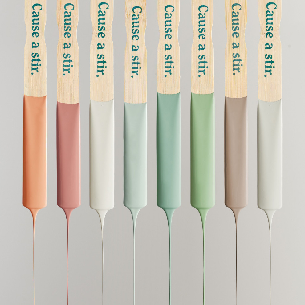
5. Minimalist Neutrals: The Power of Neutrals in Expressing Simplicity and Elegance
In a world filled with loud and vibrant colors, sometimes it's the understated beauty of neutrals that truly captivates us. Neutrals, like soft grays, warm beiges, and muted creams, have a remarkable ability to convey simplicity and elegance in design. Whether it's a minimalist living room or a sleek logo, neutrals bring a sense of calm and sophistication to any project. So, if you're looking to make a statement without overwhelming your audience, exploring the world of minimalist neutrals is definitely worth it.
5.1 Utilizing Neutrals to Create Contrast and Balance in Design
Neutrals may be subtle, but they have a significant impact when it comes to creating contrast and balance in design. Pairing a soft gray with a bold accent color, for example, can instantly draw attention and add visual interest to any composition. Neutrals also play a vital role in maintaining harmony by acting as a calming backdrop for more vibrant elements. So, don't underestimate the power of neutrals in achieving balance and impact in your designs. They may be understated, but they certainly know how to make themselves heard.
6. Metallic Accents: Exploring the Allure of Metallic Colors and their Association with Luxury
If you've ever experienced the allure of metallic colors, you'll understand why they have become such a prominent feature in the designer color palette. From shimmering golds to sleek silvers, metallic accents add a touch of luxury and opulence to any design. They evoke a sense of glamour and sophistication that can elevate even the simplest of projects. So, if you're looking to create a design that exudes elegance and prestige, incorporating metallic accents is the way to go.
6.1 Incorporating Metallic Accents to Add Depth and Dimension in Design
Beyond their association with luxury, metallic accents also have the incredible ability to add depth and dimension to design. They catch the light in fascinating ways, creating visual interest and texture. Whether it's a metallic foil finish on packaging or a subtle shimmer in a logo, these accents bring life and vibrancy to your creations. So, don't be afraid to experiment with metallics and let them take your designs to a whole new level of brilliance.
7. Harmonious Color Schemes: Exploring Complementary and Analogous Color Palettes
In 2024, harmonious color schemes will continue to dominate the design world. Complementary and analogous color palettes will be particularly popular for their ability to create a visually pleasing and balanced composition. Whether it's pairing warm oranges with cool blues or blending analogous shades of green, these harmonious combinations offer a sense of cohesion and harmony that resonates with viewers. So, if you're aiming for a design that feels both cohesive and inviting, exploring these color schemes is a must.
7.1 Creating Visual Impact with Contrasting Color Combinations
On the flip side, bold and contrasting color combinations will also be making waves in 2024. Pairing vibrant hues that lie on opposite ends of the color spectrum creates a striking visual impact that immediately catches the eye. Think deep purples against bright yellows or rich blues next to fiery oranges. These contrasting combinations inject energy and excitement into your designs, demanding attention and leaving a lasting impression. So, if you're feeling adventurous and want your designs to stand out from the crowd, don't shy away from embracing the power of contrasting colors.
8. Integrating the Palette: Applying the Color Palette in Graphic Design
When it comes to applying the designer color palette of 2024 in graphic design, the key is to strike a balance between staying on-trend and considering the specific needs of your project. Experiment with minimalist neutrals as a base to create a clean and modern look. Incorporate metallic accents strategically to add that touch of elegance and depth. And when it comes to color combinations, let the harmony or contrast guide your choices, depending on the mood and message you want to convey. Remember, it's all about finding the right balance and letting the colors enhance your design without overpowering it.In conclusion, the designer color palette of 2024 offers a myriad of exciting possibilities for creative professionals. From bold and vibrant hues to tranquil nature-inspired tones, and minimalist neutrals to eye-catching metallic accents, the choices are abundant. By understanding the significance of these colors and incorporating them thoughtfully, designers can create visually captivating and emotionally resonant designs. Whether in graphic design, interior design, fashion, or any other creative field, embracing the color trends of 2024 will undoubtedly elevate the impact and longevity of your work. So, let your imagination run wild and embrace the transformative power of color as you embark on your design journey in the vibrant year of 2024.


Comments
Post a Comment